Case study · 2025 · Present
Unwind
Cutting decision fatigue: an AI-driven companion that recommends movies, music and books based on your current mood.
Role
Lead Product Designer & Founder
Timeline
2025 · Present
Scope
AI recommendation engine, Mobile UX, Design system
Context
Decision paralysis in digital entertainment
01
Overview
Designing for mood, not catalog browsing
Streaming services overload users with endless rows of content. Unwind flips the paradigm by starting with emotional state rather than categories, reducing the average decision time from minutes to seconds.
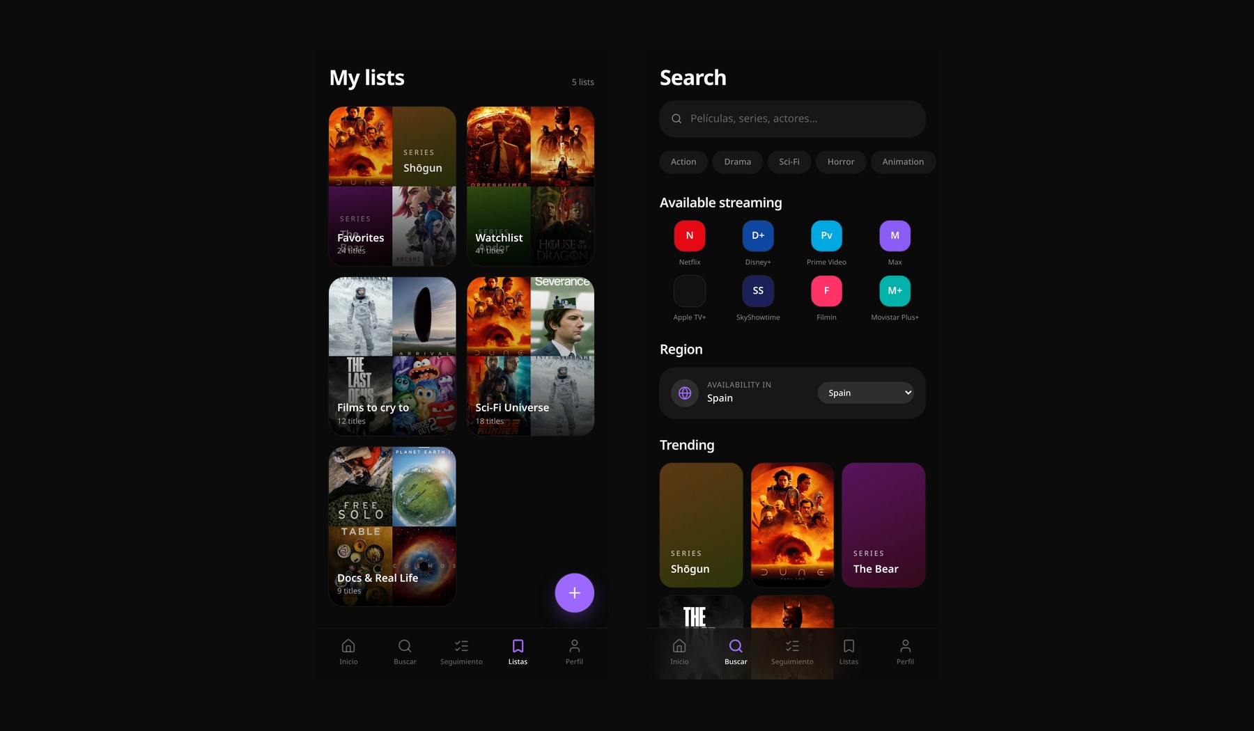
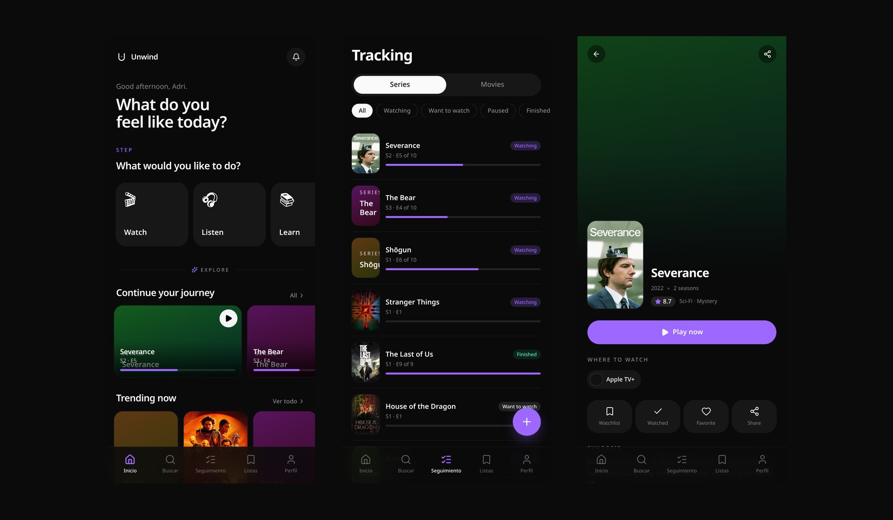
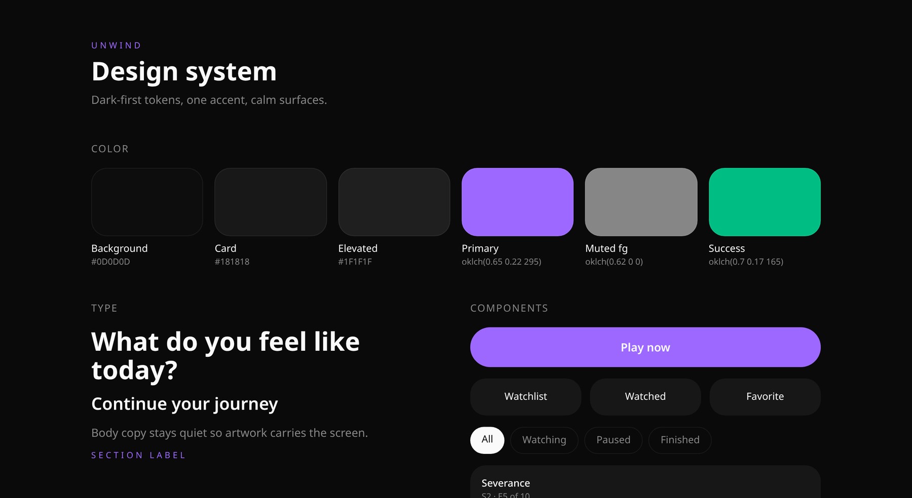
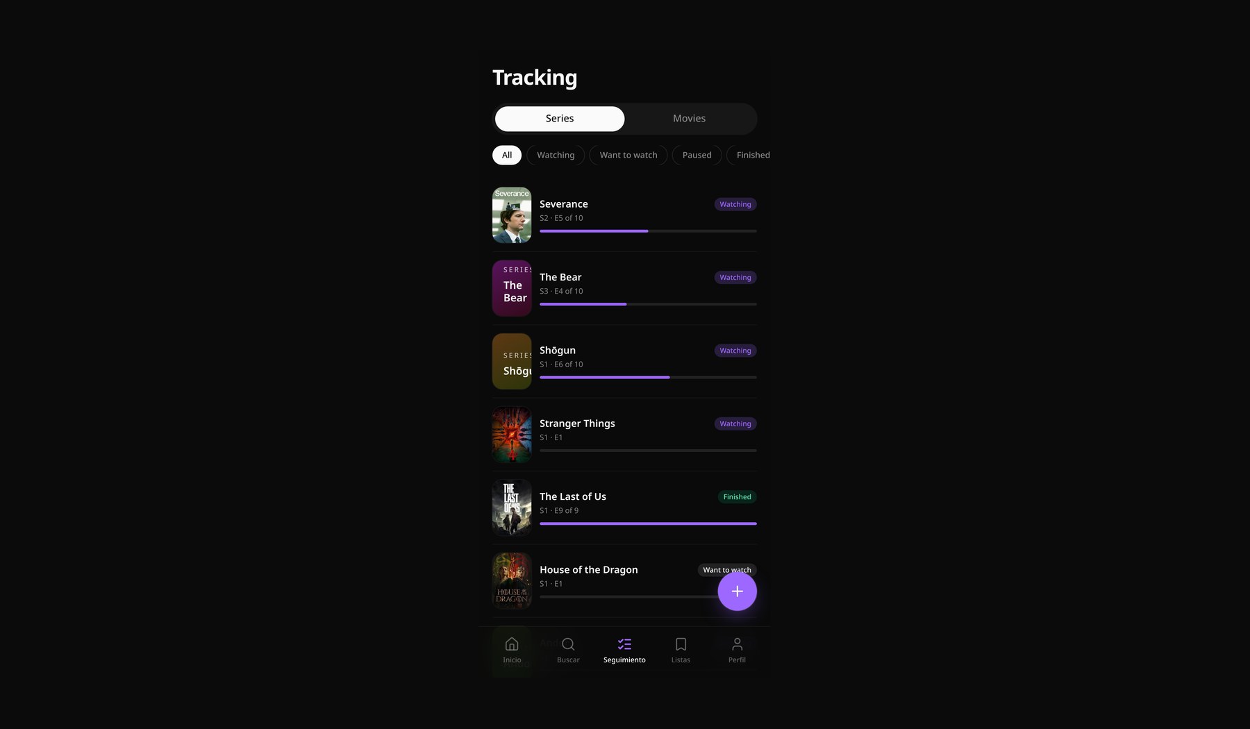
The flow maps activity, mood, time, company and content type into one confident pick, then quietly tracks what you actually finished, loved and want to revisit.
02
Design system
Tactile interfaces for low cognitive load
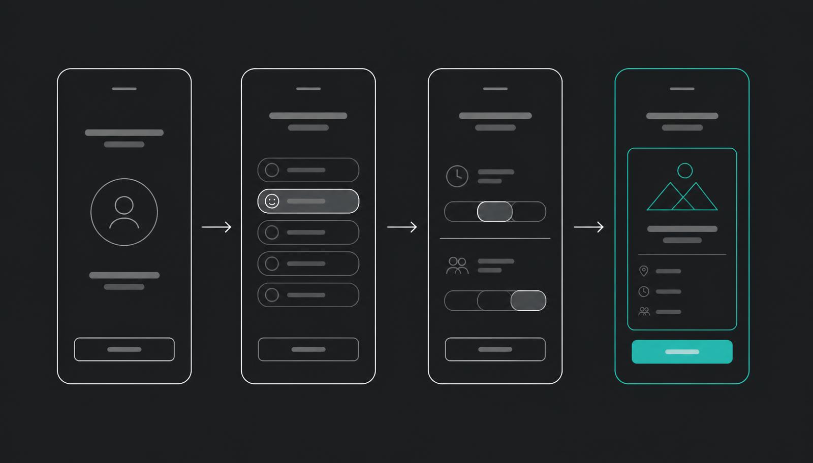
I built a dark-mode visual system focused on ambient colour, subtle haptics and minimal text to keep the environment calm and distraction free.
Trade-off: I dropped cover-art-led browsing from the home screen. It tested as familiar but pulled people straight back into scrolling, which is the behaviour the product exists to remove.
03
Research
What user feedback revealed
Direct research showed people were overwhelmed by recommenders that required heavy onboarding. Three signals repeated:
- I know what I like, I just cannot find it when I need it.
- Mood beats genre. The same person picks radically different content on a tired Tuesday and a lazy Sunday.
- Tracking only sticks if it takes one tap. Anything more is a diary.
The answer was a one-tap interaction model that learns preferences implicitly over time, instead of an onboarding questionnaire.
04
Decisions
What I cut, and why
Decision: start with mood, not catalog. Supported by test sessions where mood-led prompts cut time-to-choice from minutes to under thirty seconds. Led to a five-tap quiz replacing the home grid.
Decision: no account-level taste onboarding. Supported by drop-off in the first prototype, where long preference setup lost people before their first pick. Led to implicit learning from what gets saved and finished.
Decision: one hero result, never a row. Supported by users treating any list as a new browsing surface. Led to a single card with a one-line reason, and a discreet reroll instead of alternatives.
Cut: social feeds and friend activity. Interesting, but every version added comparison pressure to a product meant to feel calm.
05
The Vibe Quiz
Five taps to a confident pick.
The core interaction is a short, cinematic quiz: watch, listen, learn or play, then mood, time, company and content type. Each step is a single row of pill buttons. No lists, no dropdowns.
The final result is a single hero card with the pick, poster art and a one-line reason why we chose it. Never a grid.
06
Library
Everything you have loved, in one calm room.
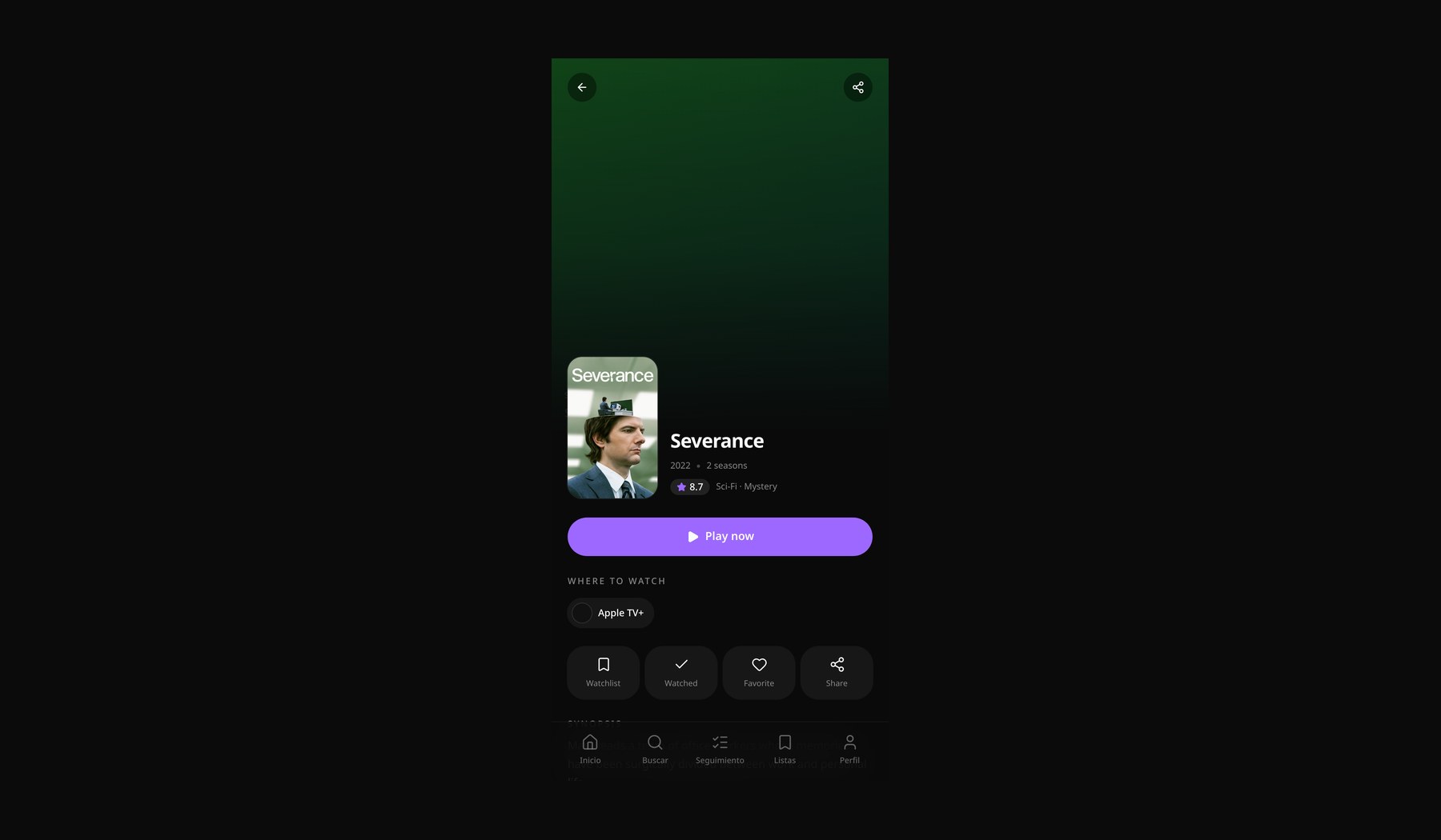
Under the recommender lives a personal library: continue watching, lists, history, and a quietly opinionated because-you-watched row. It is the only place in the app where a grid is allowed.